RaidPools
Description
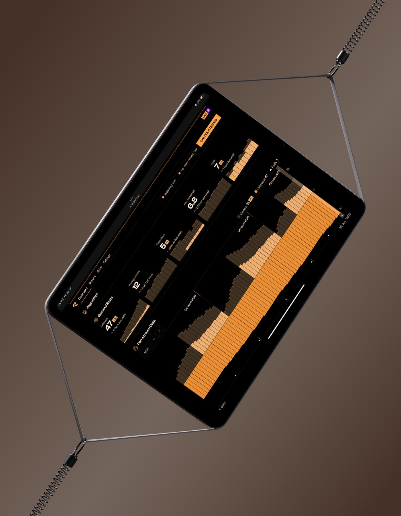
RaidPools is a software as a service (SaaS) startup that aids small Twitch streamers as they grow using its recommendation algorithm. As the founding designer, I created its branding and web app.
Try RaidPools- Date
- 2023-09 to present
- Colors
- orange
- black
- white
- Media
- UI/UX design
- brand identity design
- development
- Roles
- founding designer
- front-end web developer
Research
Twitch is a video game live-streaming platform that dominates the industry. While it boasts 35 million average daily viewers, more than 90% of streamers have fewer than 6 viewers.
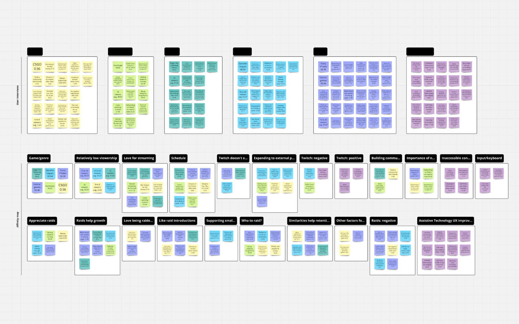
Interviews revealed that growth is difficult for small streamers as viewers cannot discover them organically.
Streamers seek reliable ways to discover other streamers in the same community, exposing them to new viewers who like similar content.
RaidPools aims to provide clear and reliable recommendations that pool like-minded streamers together, fostering growth for both individual streamers and the larger community.
For such a service to be successful, I outlined the following design principles:
- Approachable
- Core functionality is presented clearly without jargon.
- Accessible
- Provide the best possible experience for all users.
- Memorable
- Deliver a distinct identity that users will remember.
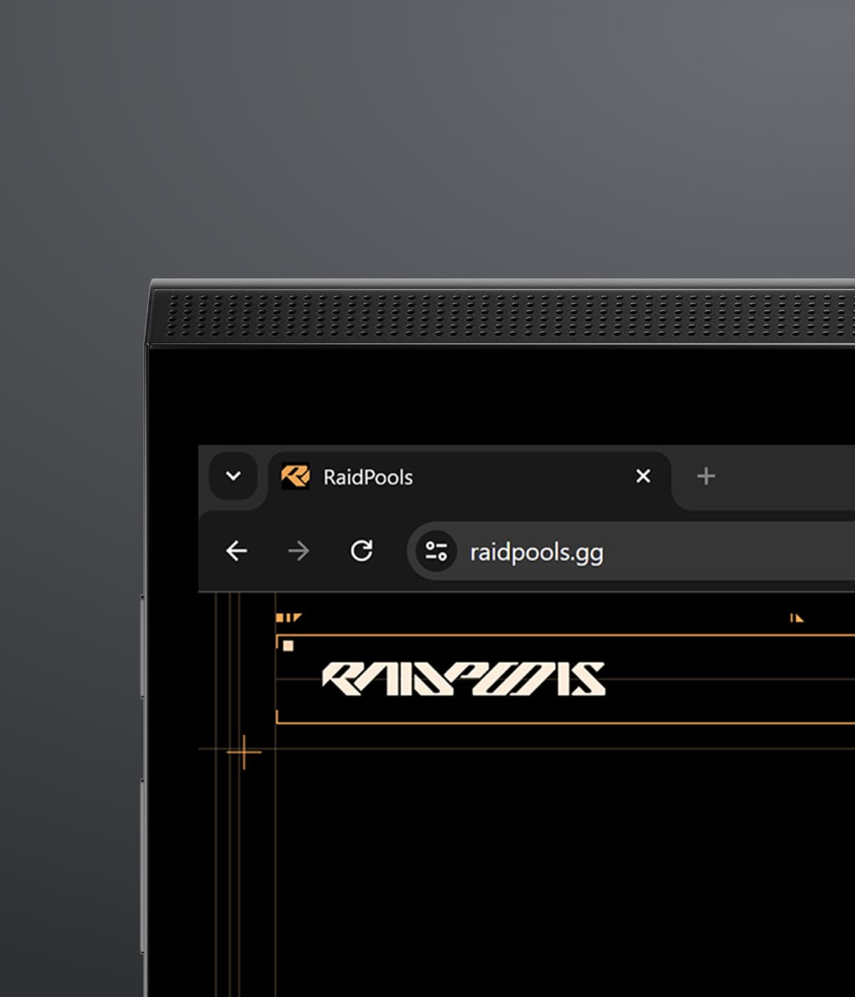
The RaidPools brand is bold and brutally geometric. The typography is structured and constrained, exhibiting a mechanical precision that is hard to forget.
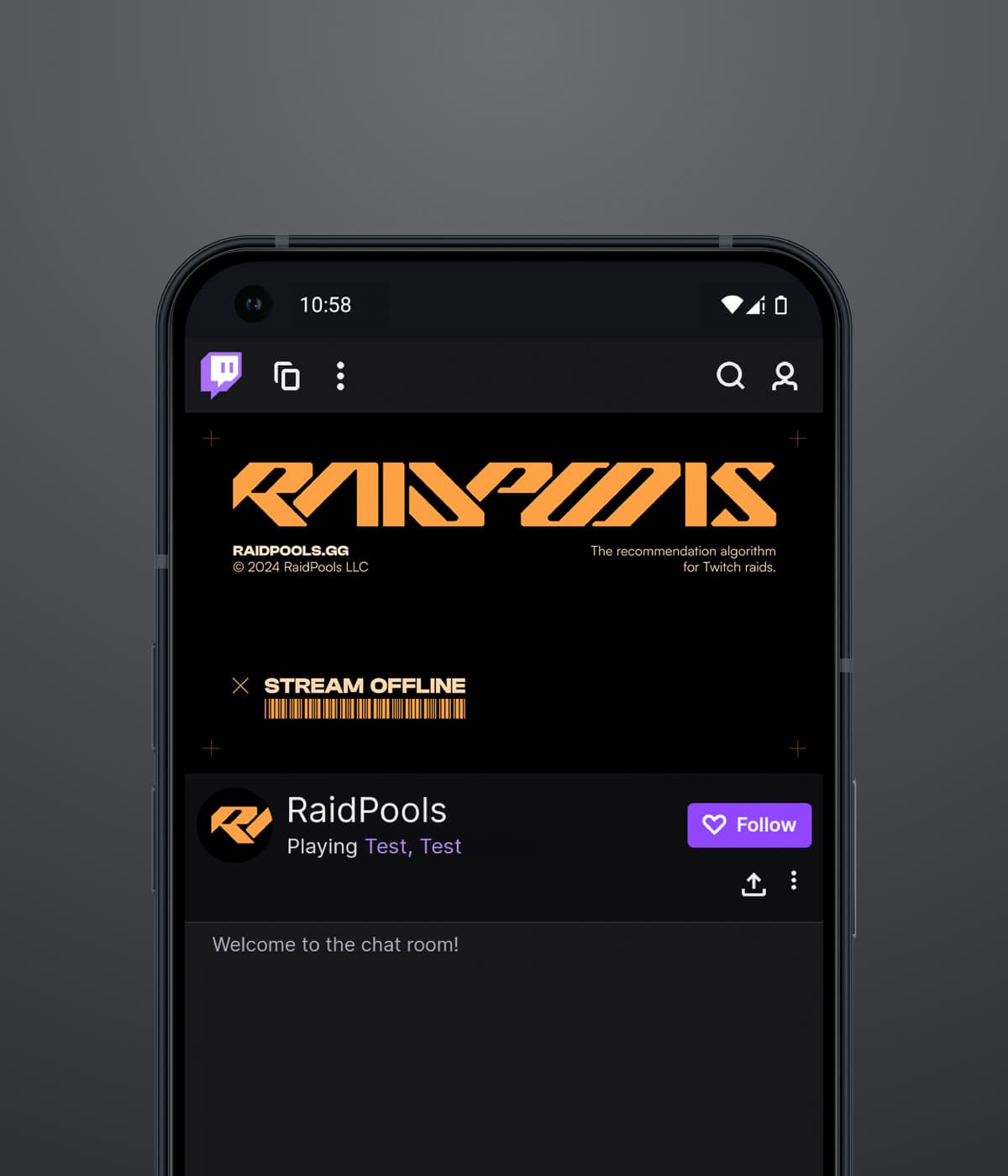
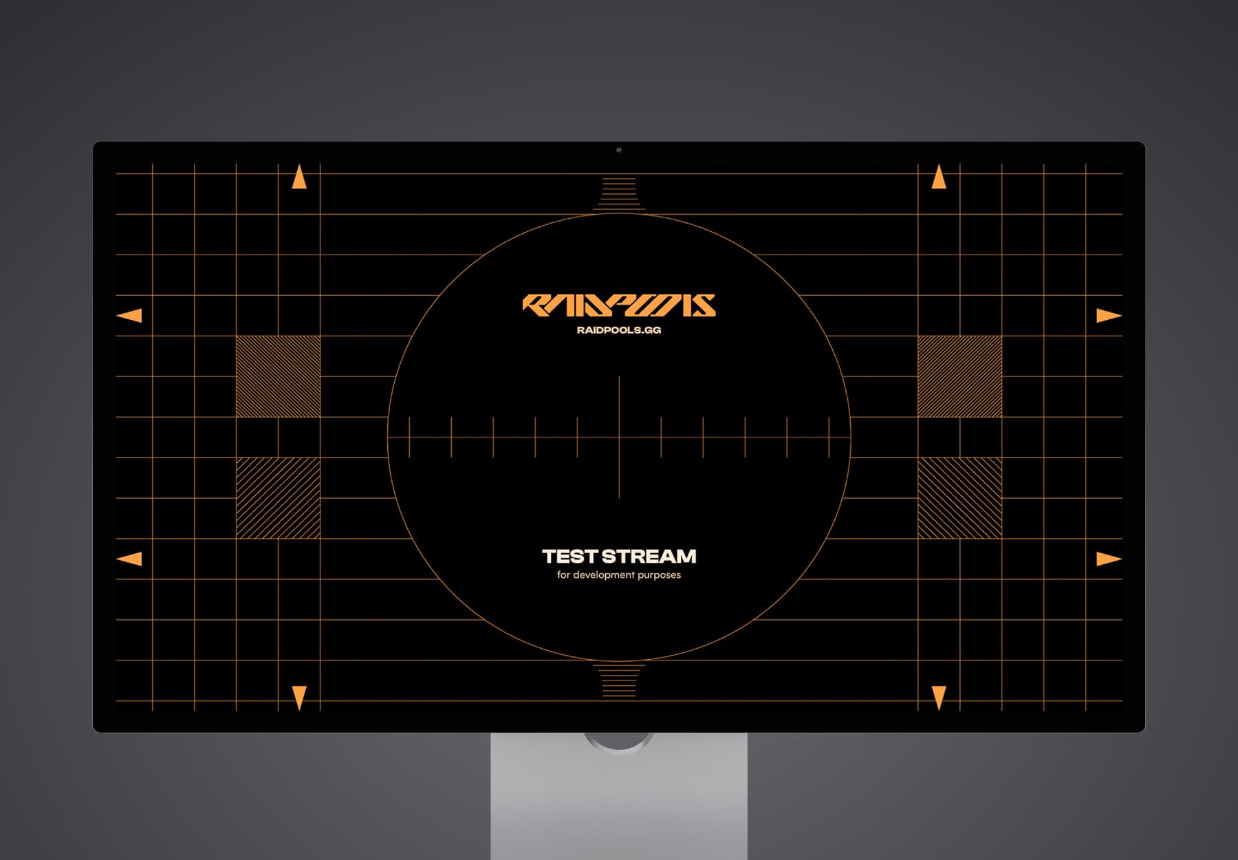
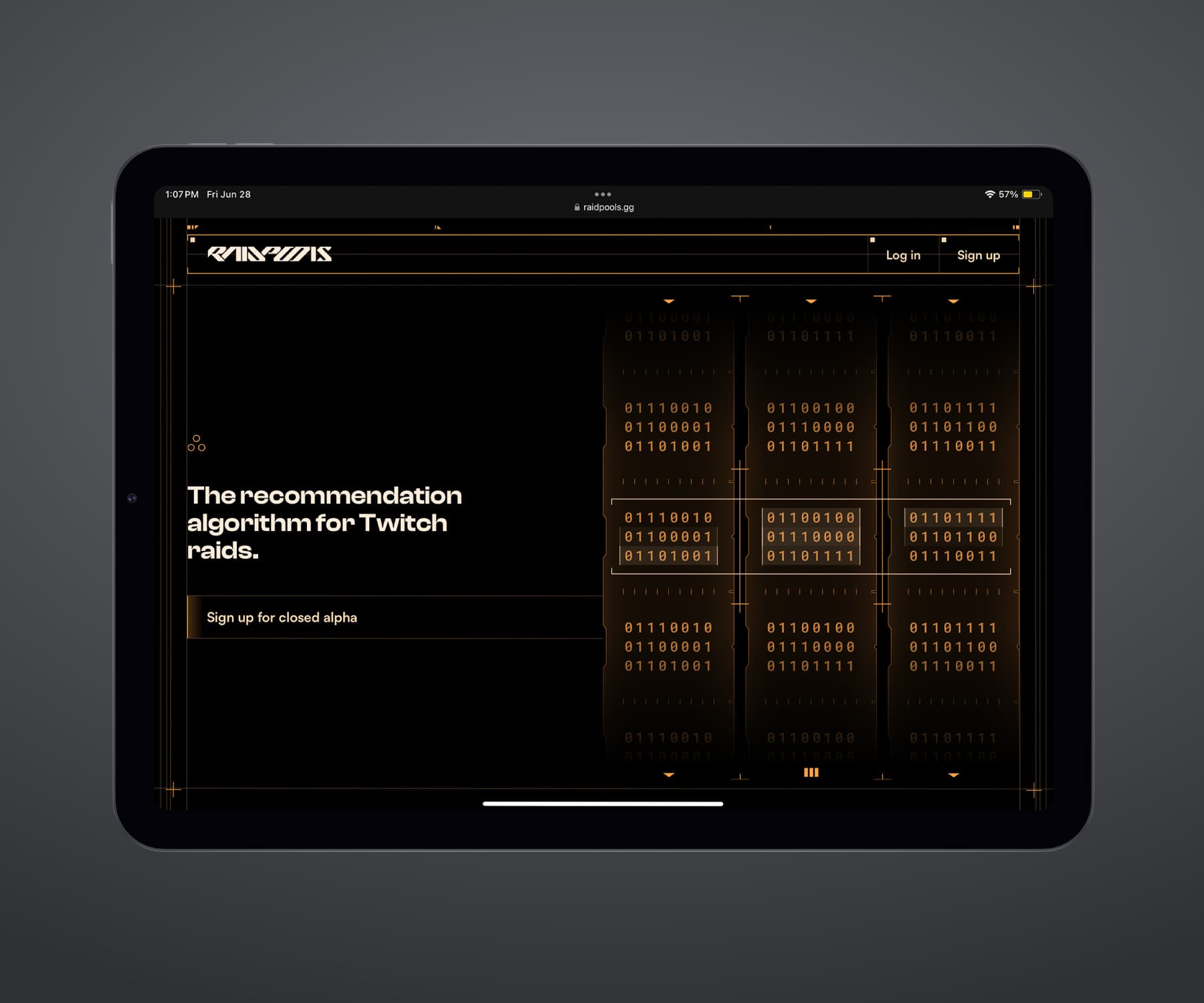
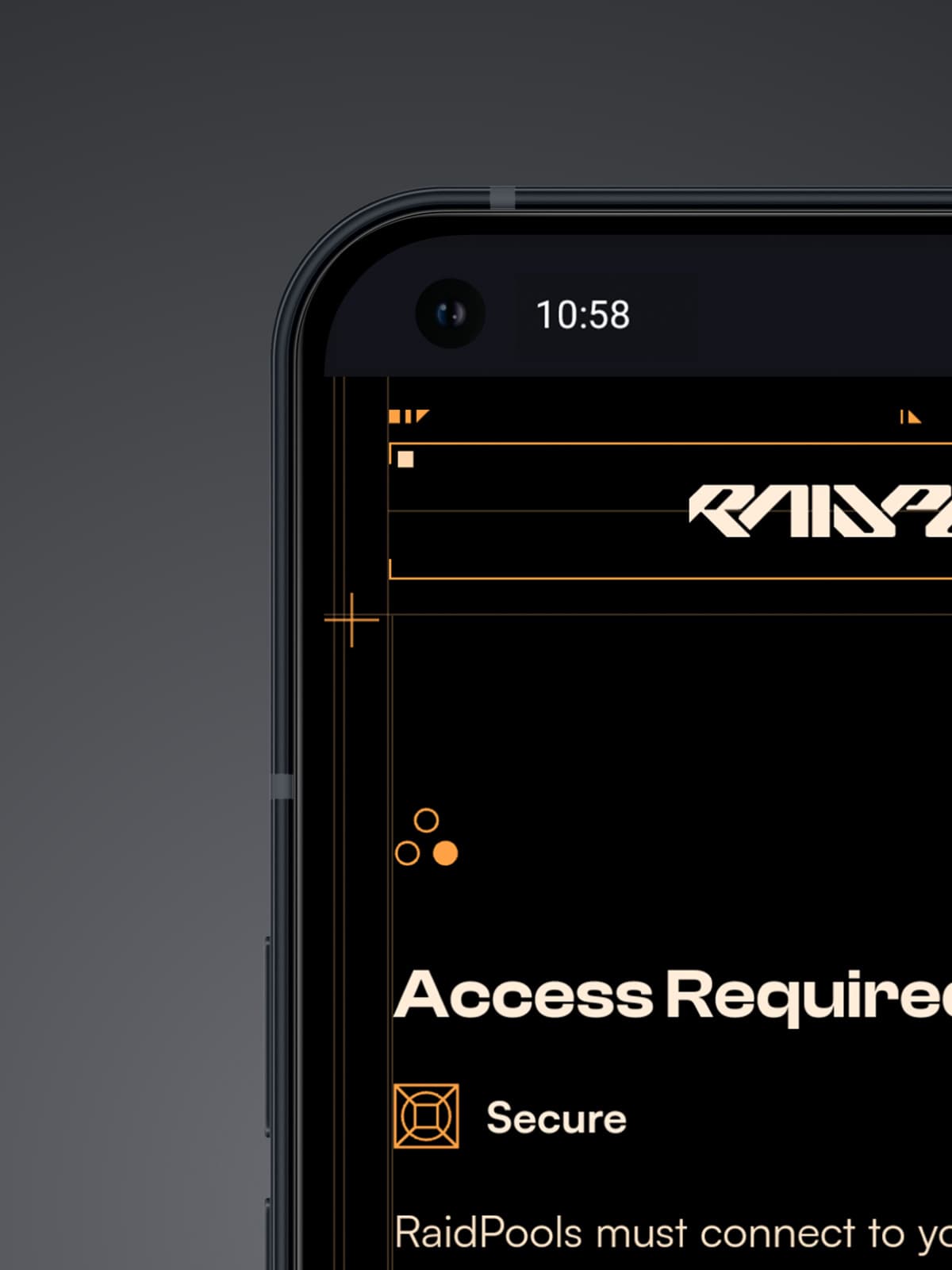
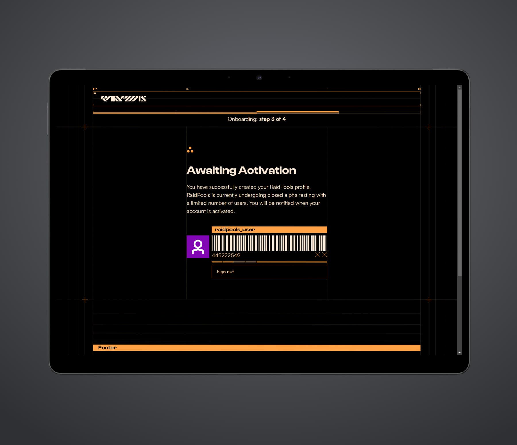
The RaidPools web app draws heavily from cassette futurism designs from games like Fallout 4, Alien: Isolation, and Signalis.
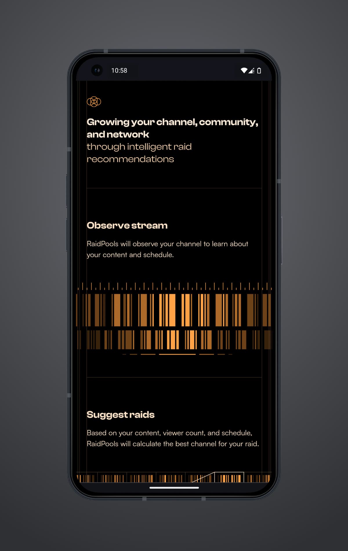
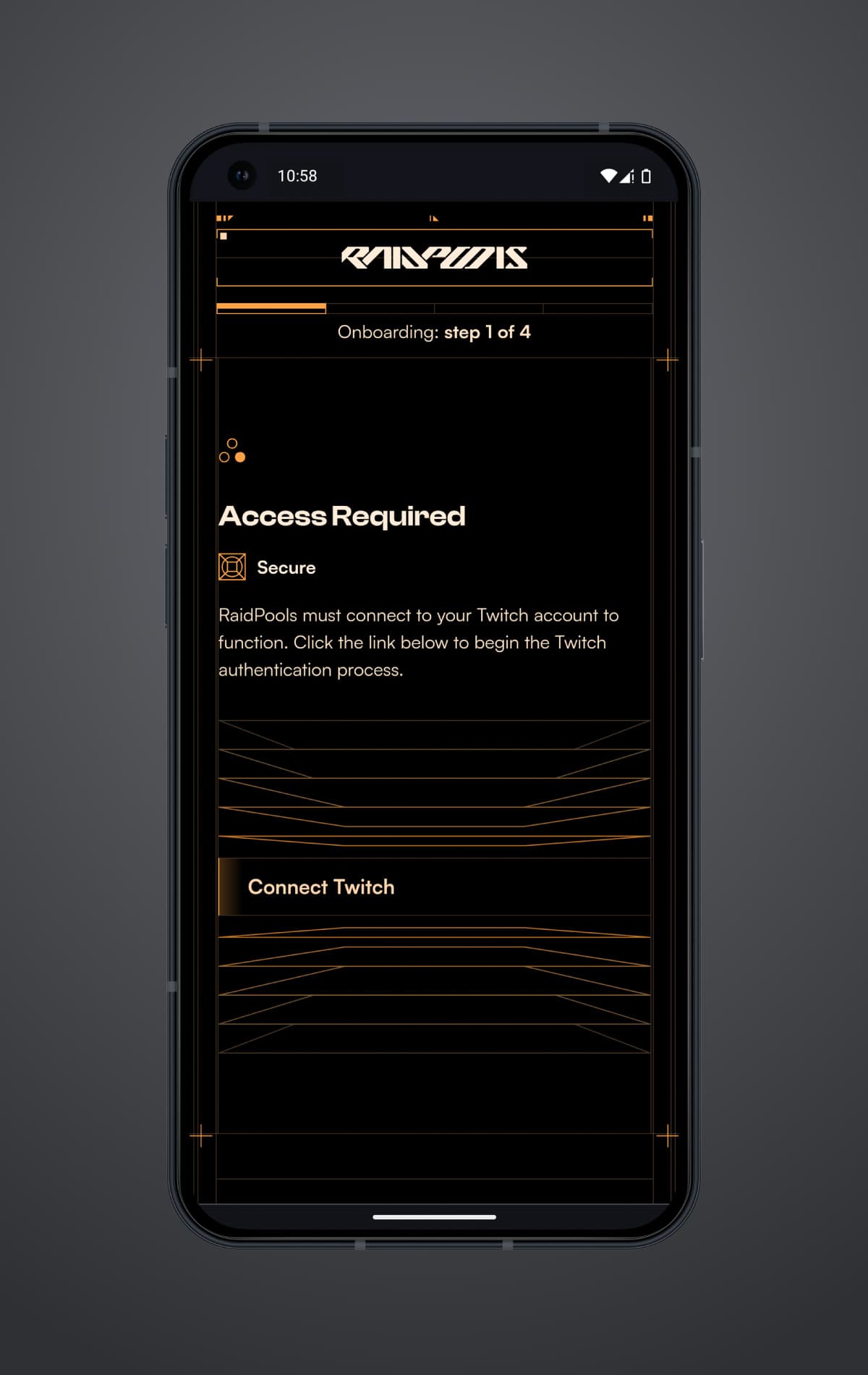
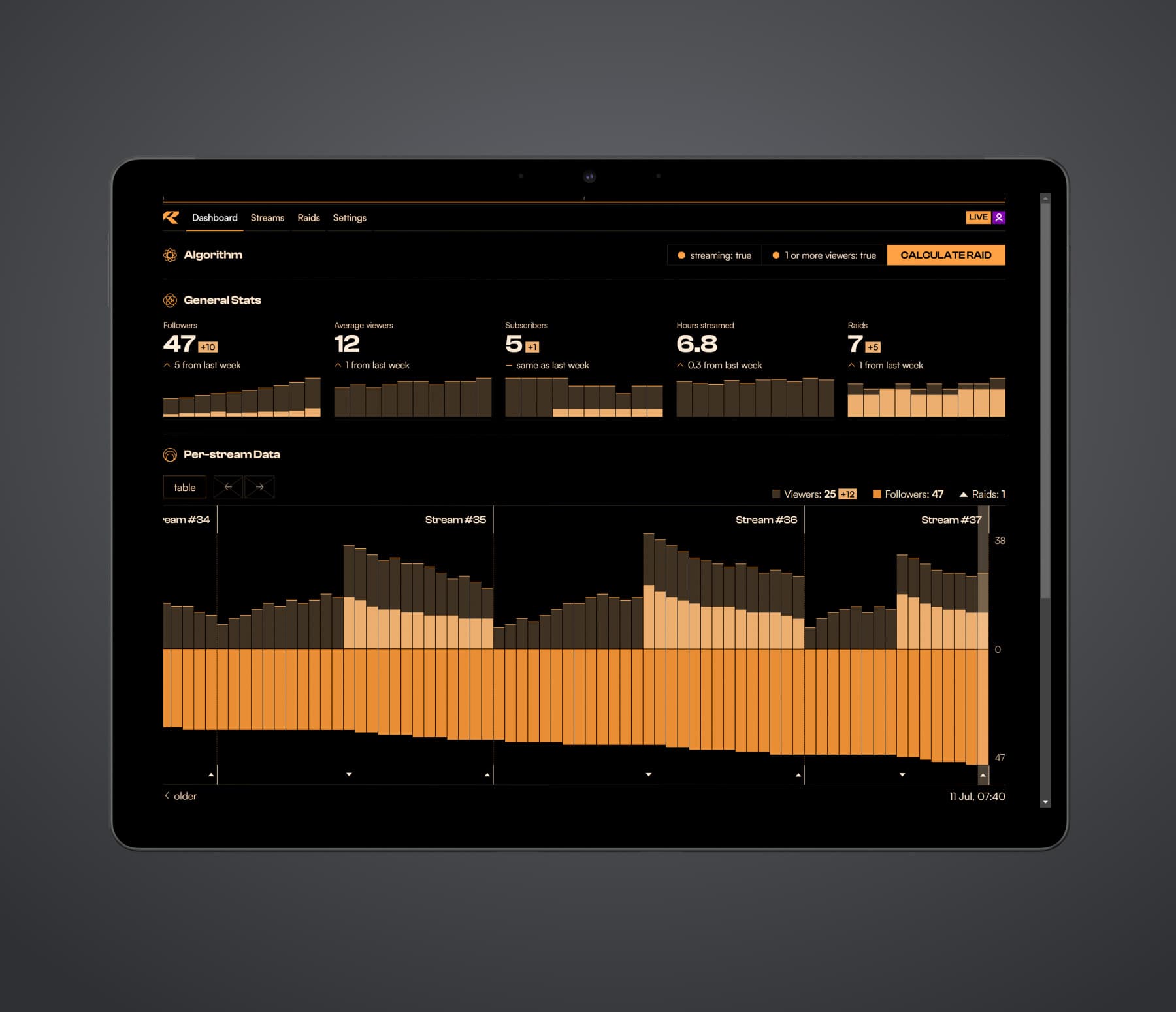
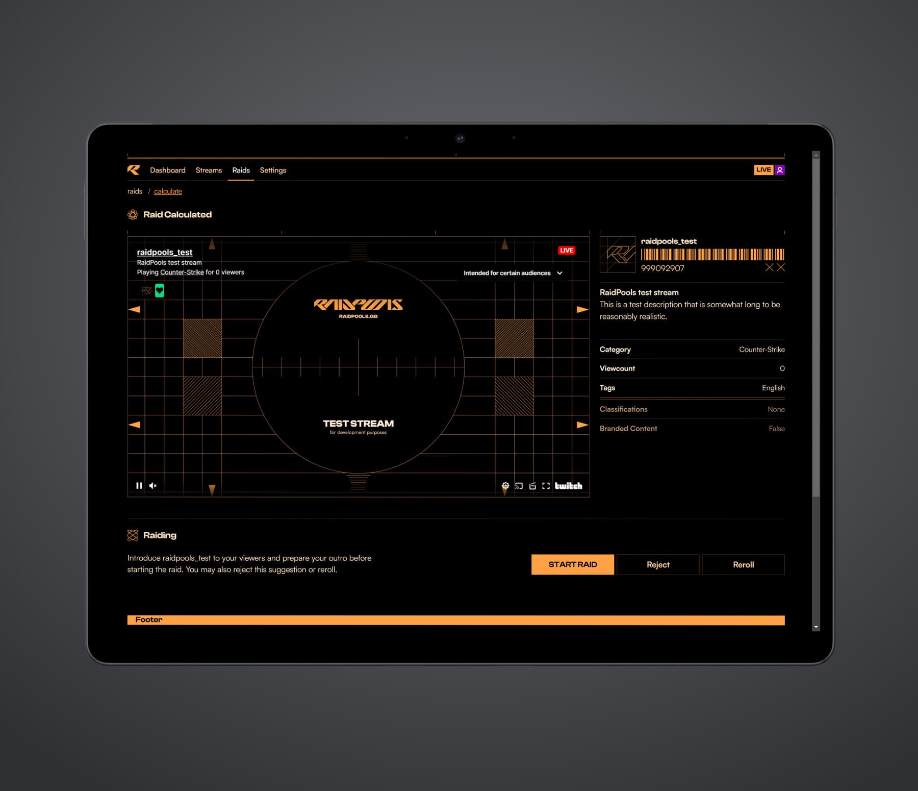
The interface strikes a balance between decoration and visual clarity. The result is a distinct aesthetic that maintains good visual hierarchies.
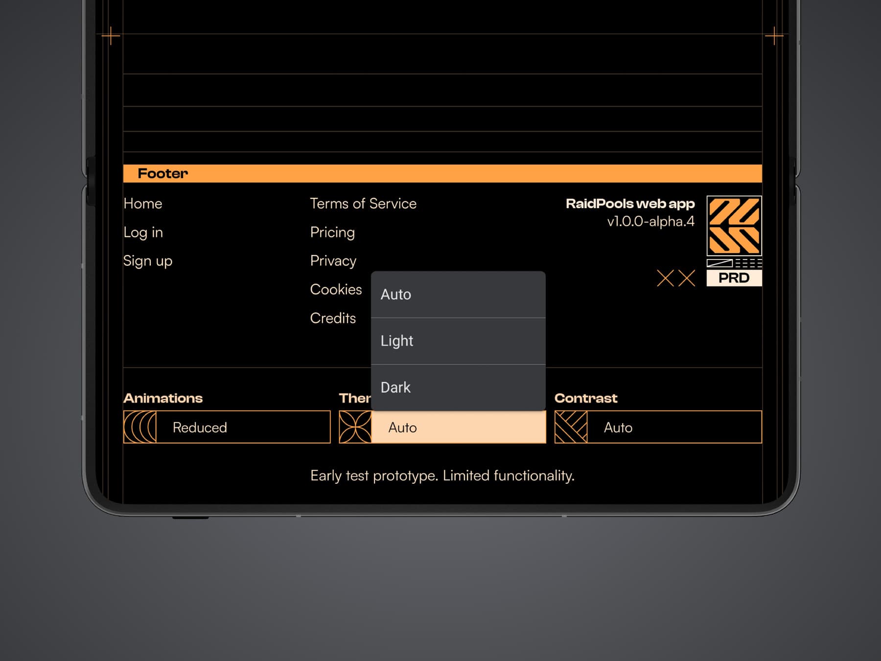
The interface has animation, theme, and contrast settings that respect the user’s system preferences by default.
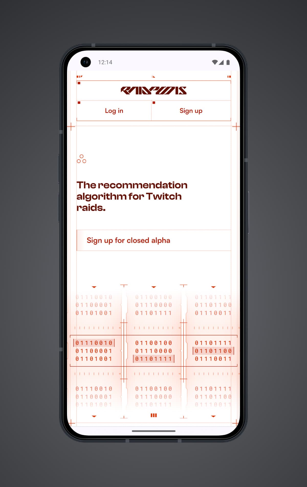
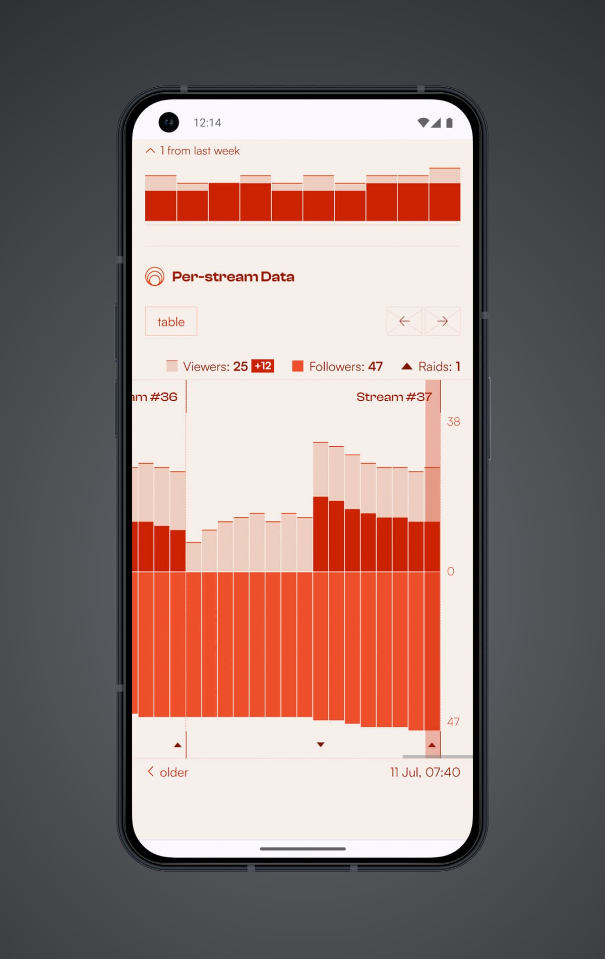
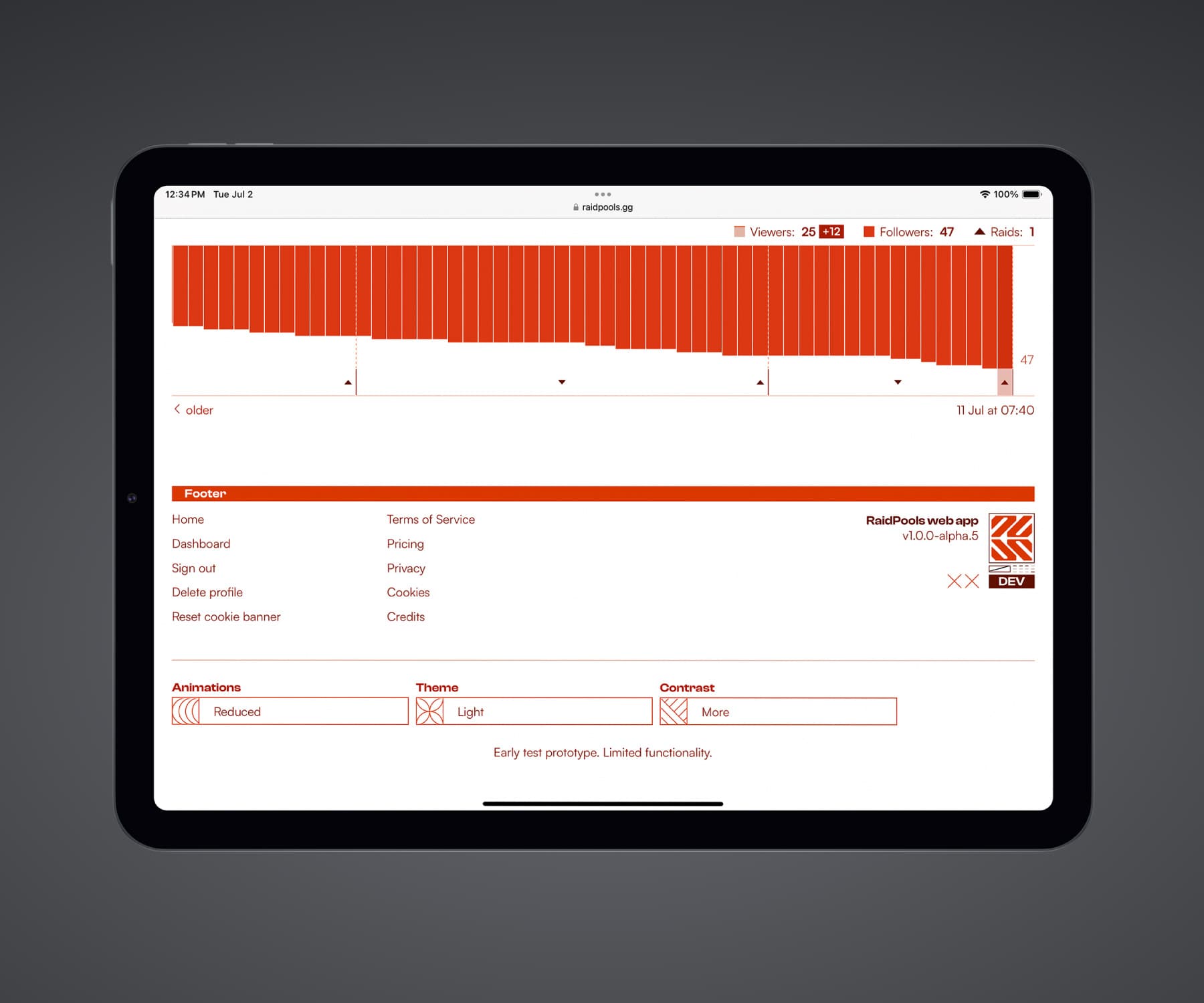
To provide the best experience for assistive technology users, the web app was initially designed as an accessibility tree before any visuals were created:
Header
Graphic “RaidPools logo with futuristic and angular lettering.”
Unordered list “Authentication.” 2 items
Link “Log in.” Points to /login
Link “Sign up.” Points to /signup
Main
Heading 1 “The recommendation algorithm for Twitch raids.”
Link “Sign up for closed alpha.” Points to /signup
Graphic “Three rolls of tape filled with binaries passing through a scanner as it searches for the optimal choice.”
Heading 2 “Growing your channel, community, and network through intelligent raid recommendations”
Ordered list “Algorithmic steps.” 4 items
List item
Heading 3 “Observe stream”
...
This approach was received positively by assistive technology users:
“Props on that because a lot of people don't think of it that way. No wonder the website looks pretty but doesn't hinder the screen reader.”
“Websites these days are not good, I was preparing for the worst. Compared to all the websites out there, this website is perfect.”
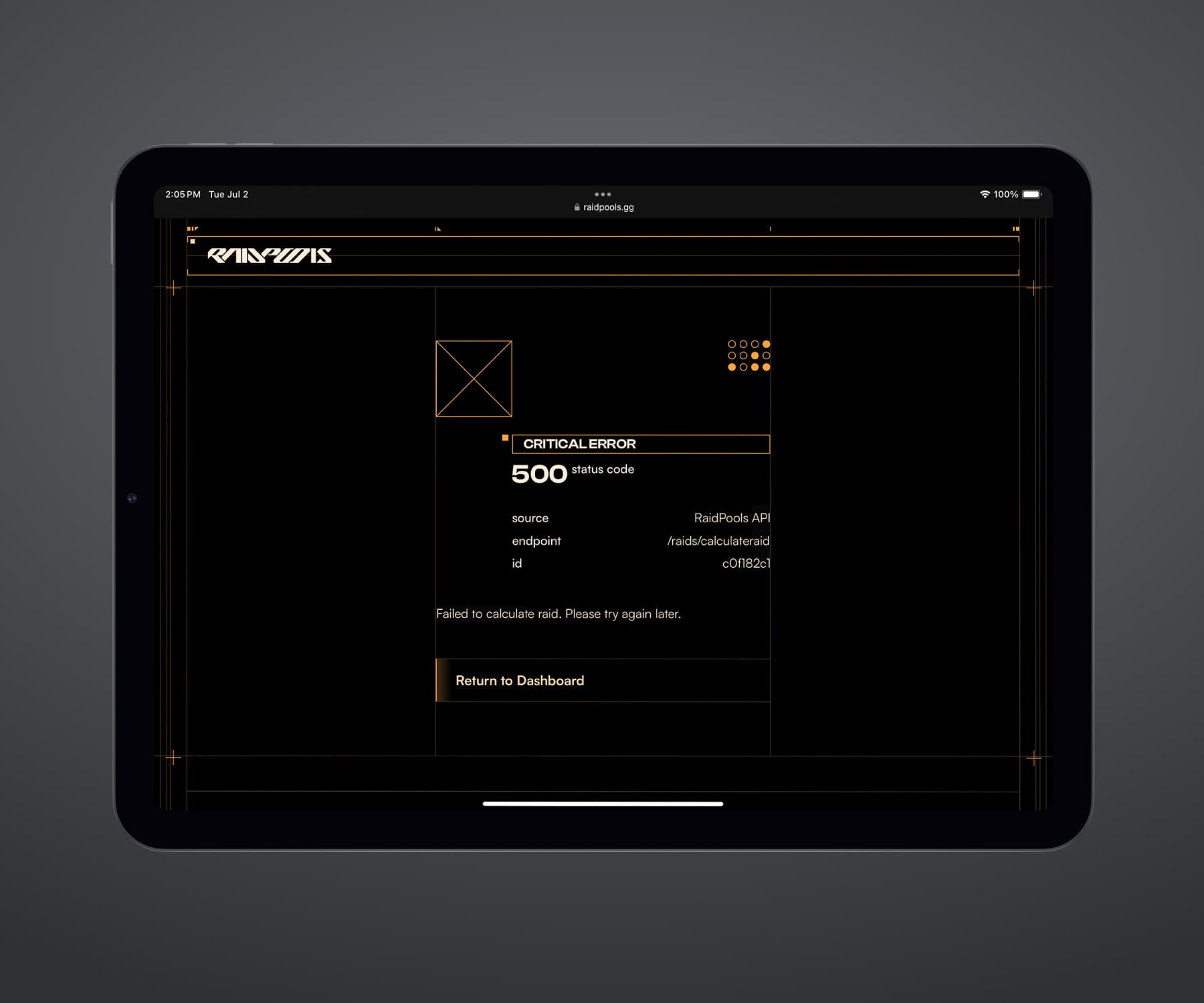
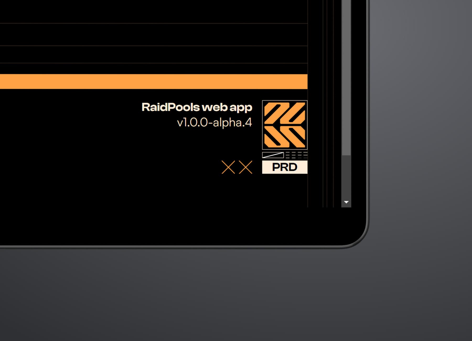
Indicators and additional information are included in the interface for a better developer experience. The indicators give developers critical information but look like decoration to users.
RaidPools is undergoing closed alpha testing with a select number of users. If you are interested, sign up using the link below. The service will become generally available once the experience is polished.
Try RaidPools